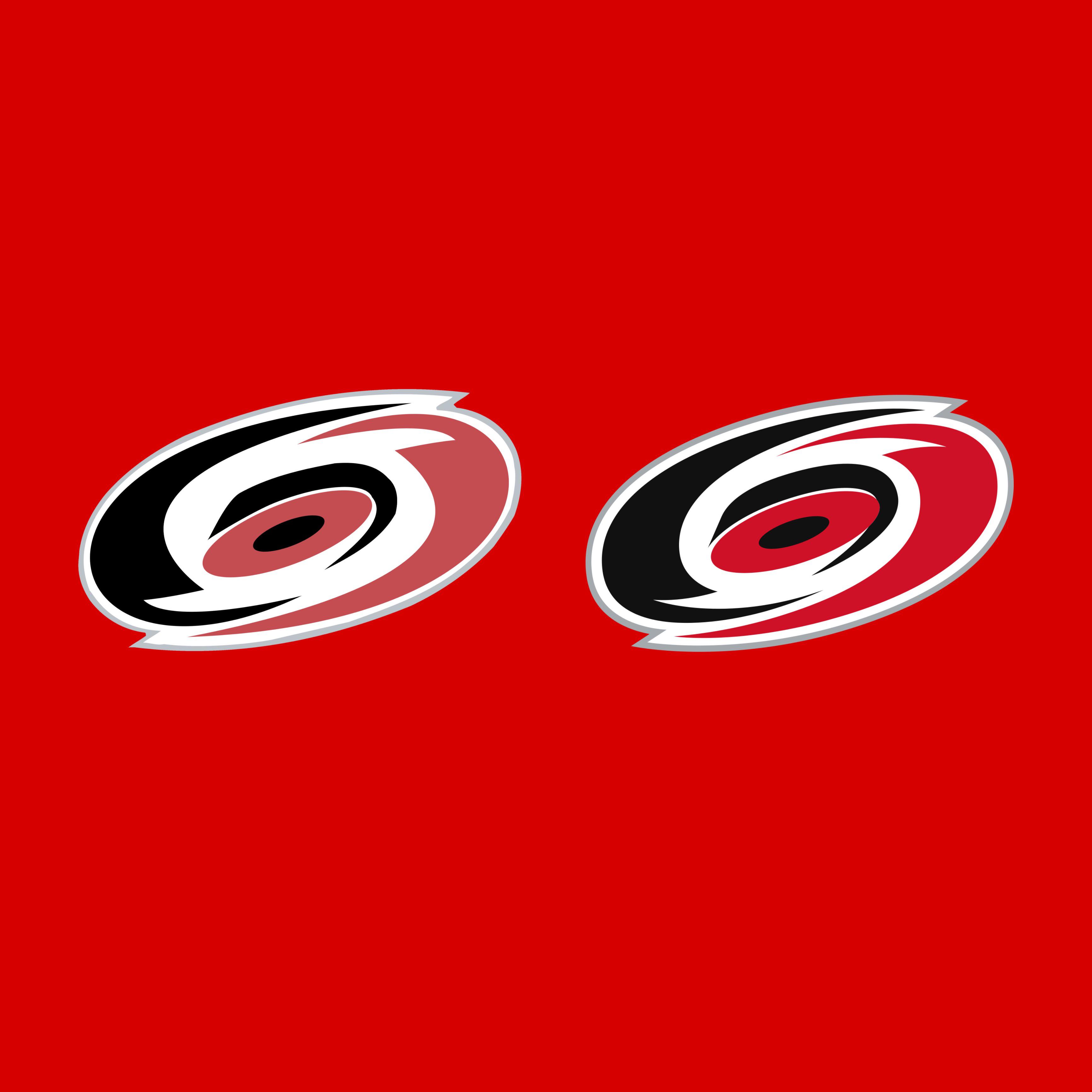
Old or New Logos Part 27: Carolina Hurricanes by ConstructionOk765 hockeyice hockeyNational Hockey LeagueNHL Prev Post Trevor Lewis Summer 2023 Lacrosse Highlights August 22, 2023 Next Post $20- Avs Reverse Retro Team Issue Fanatics Pro Shirt (size L) August 22, 2023 23 Comments TampaJayLightning 3 years ago I like the deeper red! Booftroop 3 years ago Compare it to the whale, you cowards! slapmesiIIy 3 years ago Definitely new. More contrast with the saturated red, sharper lines, and shapes that flow much better girhen 3 years ago If you’re going to have black and white, you better not have a muted color to go with them. Though Carolina still has the most overused combination of three colors in sports – [or in history](https://www.denverpost.com/2014/08/20/breaking-down-jack-whites-color-obsession-2/). outofdate70shouse 3 years ago New someguyburneraccount 3 years ago This is another one that just looks like they changed the printer cartridge Boring_Pace5158 3 years ago Insert Pam from the Office meme where she says “they’re the same picture” PoonGoon42069 3 years ago Should have compared it to the flag logo on the new home jerseys. Willmatic88 3 years ago I never even noticed it was different. AceConspirator 3 years ago Possibly the worst logo in all of sports. [deleted] 3 years ago [deleted] magicandfire 3 years ago Art director: “Make it look *MORE AGGRESSIVE!*” Comet_Empire 3 years ago The worst part is they paid some design firm like $100,000 to redesign the logo by just using the shade of red one box over on the pantone scale. whalecardio 3 years ago The left one looks like a rough draft. _Travelling_Dude 3 years ago THEY’RE THE SAME DAMN THING!! dragons_fire77 3 years ago I just default like our alt logo so much more. Hockey stick+hurricane warning+NC in negative space. Just better design all around. v13ragnarok7 3 years ago They both look like they were generated by a free AI app chukporkka 3 years ago Tf is the logo on the left tho. Looks hand drawn Independent_Ad_3928 3 years ago I see the bloodshot eyes of a large angry red creature. Like17Badgers 3 years ago the old one looks… melted Oiler_boiler 3 years ago I’ll give the same answer I have to the rangers post there the same logo paul-cus 3 years ago Old korkkis 3 years ago The one on right is graphically more refined but it’s still quite ugly Write A CommentYou must be logged in to post a comment.
slapmesiIIy 3 years ago Definitely new. More contrast with the saturated red, sharper lines, and shapes that flow much better
girhen 3 years ago If you’re going to have black and white, you better not have a muted color to go with them. Though Carolina still has the most overused combination of three colors in sports – [or in history](https://www.denverpost.com/2014/08/20/breaking-down-jack-whites-color-obsession-2/).
someguyburneraccount 3 years ago This is another one that just looks like they changed the printer cartridge
Boring_Pace5158 3 years ago Insert Pam from the Office meme where she says “they’re the same picture”
Comet_Empire 3 years ago The worst part is they paid some design firm like $100,000 to redesign the logo by just using the shade of red one box over on the pantone scale.
dragons_fire77 3 years ago I just default like our alt logo so much more. Hockey stick+hurricane warning+NC in negative space. Just better design all around.


23 Comments
I like the deeper red!
Compare it to the whale, you cowards!
Definitely new. More contrast with the saturated red, sharper lines, and shapes that flow much better
If you’re going to have black and white, you better not have a muted color to go with them. Though Carolina still has the most overused combination of three colors in sports – [or in history](https://www.denverpost.com/2014/08/20/breaking-down-jack-whites-color-obsession-2/).
New
This is another one that just looks like they changed the printer cartridge
Insert Pam from the Office meme where she says “they’re the same picture”
Should have compared it to the flag logo on the new home jerseys.
I never even noticed it was different.
Possibly the worst logo in all of sports.
[deleted]
Art director: “Make it look *MORE AGGRESSIVE!*”
The worst part is they paid some design firm like $100,000 to redesign the logo by just using the shade of red one box over on the pantone scale.
The left one looks like a rough draft.
THEY’RE THE SAME DAMN THING!!
I just default like our alt logo so much more. Hockey stick+hurricane warning+NC in negative space. Just better design all around.
They both look like they were generated by a free AI app
Tf is the logo on the left tho. Looks hand drawn
I see the bloodshot eyes of a large angry red creature.
the old one looks… melted
I’ll give the same answer I have to the rangers post there the same logo
Old
The one on right is graphically more refined but it’s still quite ugly