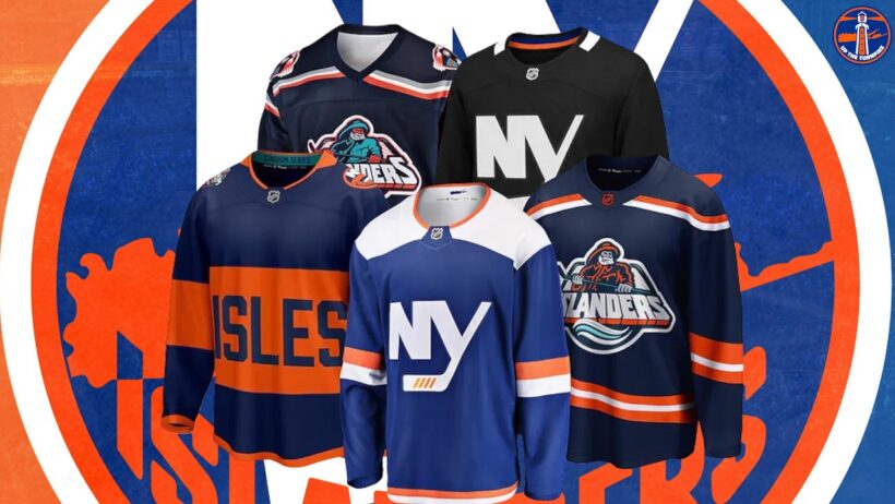
The Islanders have revealed the eight finalists for this years 3rd jersey. Both Matt and Mitch are underwhelmed by the options available to vote on.
For more content subscribe to Up the Turnpike on Patreon: https://www.patreon.com/uptheturnpike
Get your Up The Turnpike Merch at:
https://uptheturnpike.shop
#NewyorkIslanders #isles #NYIsles
I DO NOT want my team to wear ANY of these!
i saw hundreds of awesome submissions all over social media that were sick. how is it that these 8 are the cream that rose to the top? they suck.
I like the orange lighthouse and the navy NY. I did expect a bit more tbh
Im with mitch, orange lighthouse is my favorit-ish out of this group
better be the navy fisherman
Navy lighthouse:
1. Add OG crest to the shoulders
2. Change stripe pattern on sleeves and waist to Orange -> White -> Teal
Whatever Schaef wants
They really are all not creative and mid, no offense to the creators. But if schaef likes it then I like it.
It has to be original. Lighthouse orange or blue.
This was predictable. Not only are all the options not that great but I feel like they’re similar to what they have already done before for core color scheme. I saw so many cooler options that people created.
All 3 I made blow these away there’s no way they even looked at mine I wish I could show you
Woof
Again the Islanders are being lazy about a 3rd jersey once again. Can they hire some people that actually have a graphic designing degree and hire people that have a clue
Extremely underwhelming
0% these were the 8 best. The whole thing was rigged. They had it chosen before it started
Disappointing! I’ll throw my vote at the navy lighthouse, or the rugby jersey.
Wow these are the finalists ? Out of all those jerseys made, these 2 are it ? Judges need 👓
On America's 250 they should have done a Jersey honoring the Immortals who saved Washingtons Army at the Battle of Long Island . Huge facepalm on all those ugly options
Let’s be honest, no one was going to be happy with anything. Let’s just be glad it wasn’t 8 versions of the regular crest on different colored jerseys. The orange lighthouse is my favorite though, mostly cuz it’s the closest to what I submitted
Best one(s): 1st orange. Last blue top row.
Both are sweet! My pick? ….look down below.
The teal is awful – a little bit is enough if any at all. (1st Orange does it right).
1st Orange: The old school blue shoulder pads with the NY, matching navy blue cuffs and numbers with white outline. Dap!
Not a fan at all with "wavy lines" – I like how the 1st orange has a thin white and navy blue lines with mininmal "wave".
Last Blue top row: Sweet. Love it! The colours and how they are laid out kick a$$, thin lines w/o much "wave" – Big old dirty ISLANDERS bent across the chest, blue numbers and orange outline …is tight hockey fans.
Winner – Last blue top row – looks "hockey authentic".
I loved so many cream colored jerseys that I figured if any of the cream colored ones I saw won, it would be an absolute purchase for me. I feel like maybe, maybe 2 of these deserve to be in the finals.
All suck. They are all UGLY
Are all of these AI generated?
They're all fkn disgusting but out of the 8 I'm going Navy Lighthouse.
NOOOOOO TO THE LIGHTHOUSE!!!! IT LOOKS LIKE A TRAFFIC CONE OR PYLON!!!!!!
🤢none!!!!
The "NY" and Navy Fisherman are the only 2 "NHL" worthy sweaters in the group IMHO.
These cannot be fan submissions. Look at the naming scheme of them, its the same format for each jersey just with different descriptors. "Navy Islanders, Orange Lighthouse, Orange Fisherman, Navy Lighthouse" etc…Definitely not believing these are fan submissions, smh.
They're all terrible. Just dont do a 3rd jersey.
As a lifelong fan, nothing ever makes us happy.We just want a cup.I don't care what you dress me up in.I'll wear a tuxedo.Let's just get a cup.
Agree with Mitch here, still bad finalists tho.