
Just a couple reminders from my original post, since that’s buried now:
I think the Bluenote is perfect as is, and I don’t think it needs replacing or redesigning—I’m just doing this for fun. I also think stick and puck logos are kinda dorky, but this idea stuck with me so I wanted to see it through to the end.
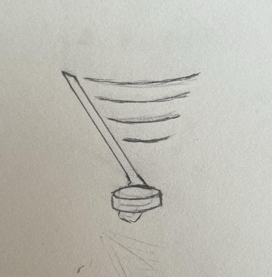
Thank you all for more feedback! Ironically, now that we’re closer to the form factor of the original Bluenote, I’m really vibing with it. The trade-off is that the “musical staff” motif gets a bit lost, and the note is technically no longer a 64th note, which is significant to STL history. For the purposes of this recreational design, I’m not sure how much that matters, but I might still do a pass closer to my initial sketch (2nd picture) where I forgo the original form factor altogether, just to see what that’s like. I’m also not feeling the yellow accents very much. I might drop them in favor of white for a “one-color” logo like the Red Wings.
Any more thoughts? Love it? Hate it?
LGB!
by Sad-Perspective4702