yeah these legitimately would have been some of my favorite jerseys all time if they were real. great job.
MainLineCB
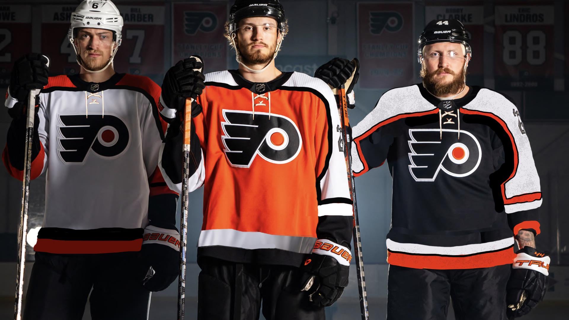
I love the current jerseys (minus the black alternate, it sucks), but these look even better!
freewheelinryan88
The piping is key. The current Flyers jerseys are missing the black and orange piping.
upcan845
They just need to fix the 1-ply sleeve numbers and they’d be a perfect revamp.
JerseyOutlawFan
Meh
Stonetoothed
I know a lot of y’all are nostalgic for those old jerseys… but I’m not and this isn’t better. These look dated as hell. The current one without the line is by no means perfect but this ain’t it either. Trim the sleeve numbers, no piping.
Thin-Data-1231
The black alternate they have now is the best sweater they have. That stadium series one from this year is also on point.
Perryplat199
I think the cuffs need slight adjustment. The whit in between the lines and the black is a bit too much.
Hi_There_Face_Here
The white and the orange are nearly perfect. Not a fan of the orange piping on the black but these are great renders of our jerseys. Maybe the best we’ve seen on this sub. Keep it up!
Motor-Housing2704
If they would only outline the numbers
Equivalent_Goose_226
Mostly dig the jerseys. Your “apology for the crudeness” line at the end would’ve been perfect if you had hidden a dildo or something in the background though
DanTreview
Piping, goddammit. They missed a huge opportunity. It gives the uni a little something special up close. I have a vintage Brind’amour jersey and the piping is my favorite thing about it (other than the name on the back)
Nice job, OP
Aussie-the-Hedgehog
I like the rebrand, but I do wish more piping was added like this one. Nicely done!
I also would have given the sleeve numbers a black outline and make them slightly bigger.
I’m hoping we can get an appropriate third. The current third has gotten worse every year. It just doesn’t stick with the rebrand. Honestly my least favorite Flyers jersey of all time.
This may not be a popular opinion, but I’d love to see this year’s Stadium Series as a third. Not many teams have a white jersey as a third anymore (I think LA is the only one presently). The striping doesn’t have to be as futuristic, but it would fit nicely imo.
Or just a black jersey consistent with the rebrand. Either one is fine.
Other-Oil-5035
I’m gonna start a band and call it “black piping”
Silver_Foxx9
I really like the white jerseys. They show up nice on screen.
Most-Iron6838
I’ve come to accept the new whites and oranges without the piping but the numbers are atrocious and need an outline
crafbicycle
Oh yes please.
Do you think you could modernize the gloves and match the schemes? Might look stupid but I know I can’t do it


18 Comments
Masterpiece
yeah these legitimately would have been some of my favorite jerseys all time if they were real. great job.
I love the current jerseys (minus the black alternate, it sucks), but these look even better!
The piping is key. The current Flyers jerseys are missing the black and orange piping.
They just need to fix the 1-ply sleeve numbers and they’d be a perfect revamp.
Meh
I know a lot of y’all are nostalgic for those old jerseys… but I’m not and this isn’t better. These look dated as hell. The current one without the line is by no means perfect but this ain’t it either. Trim the sleeve numbers, no piping.
The black alternate they have now is the best sweater they have. That stadium series one from this year is also on point.
I think the cuffs need slight adjustment. The whit in between the lines and the black is a bit too much.
The white and the orange are nearly perfect. Not a fan of the orange piping on the black but these are great renders of our jerseys. Maybe the best we’ve seen on this sub. Keep it up!
If they would only outline the numbers
Mostly dig the jerseys. Your “apology for the crudeness” line at the end would’ve been perfect if you had hidden a dildo or something in the background though
Piping, goddammit. They missed a huge opportunity. It gives the uni a little something special up close. I have a vintage Brind’amour jersey and the piping is my favorite thing about it (other than the name on the back)
Nice job, OP
I like the rebrand, but I do wish more piping was added like this one. Nicely done!
I also would have given the sleeve numbers a black outline and make them slightly bigger.
I’m hoping we can get an appropriate third. The current third has gotten worse every year. It just doesn’t stick with the rebrand. Honestly my least favorite Flyers jersey of all time.
This may not be a popular opinion, but I’d love to see this year’s Stadium Series as a third. Not many teams have a white jersey as a third anymore (I think LA is the only one presently). The striping doesn’t have to be as futuristic, but it would fit nicely imo.
Or just a black jersey consistent with the rebrand. Either one is fine.
I’m gonna start a band and call it “black piping”
I really like the white jerseys. They show up nice on screen.
I’ve come to accept the new whites and oranges without the piping but the numbers are atrocious and need an outline
Oh yes please.
Do you think you could modernize the gloves and match the schemes? Might look stupid but I know I can’t do it