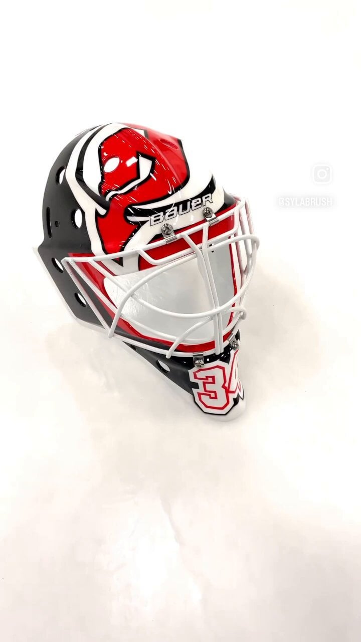
Kinda boring in my opinion. I know a lot of guys don’t go all out but man nothing gets my motor going like a beautiful goalie mask. I miss Brodeur’s iconic mask. Or that sweet carnage mask. I think clemmenson rocked that one?
MatteHatter
A little plain, I agree. But I like the simplicity too. The big bold logo. Also like the song in the video. Wish we still had it as the goal song haha.
Johnborkowski
Clean, I like it.
omnomnomnium
yo that looks GREAT. so many goalie masks are so full of inscrutable details, airbrushy flairs, etc. this is simple and clear – it’s bold, strong, and proud. Jake Allen’s a Devil and he’s looked fuckin’ great and he’ll look even better in this.
xxfatpigxx
Jake Allen steez streak continues. Can’t wait to see his gear for next season when he doesn’t have to quickly pivot late in the year with what he has already.
Starscream147
MUCH APPROVED!!!!!!!
mb303030
Love the embossed devils logos on black parts of the mask. Really slick
54moreyears
Much prefer this over the dumb picture perfect airbrush look we often see. Should look cool from the rafters not needing to see it upfront. I really miss goalies using heavy contrast and hardlines like old the McLean Canuck’s one. Actually I think the early 90’s probably had the best mask designs.


10 Comments
Kinda boring in my opinion. I know a lot of guys don’t go all out but man nothing gets my motor going like a beautiful goalie mask. I miss Brodeur’s iconic mask. Or that sweet carnage mask. I think clemmenson rocked that one?
A little plain, I agree. But I like the simplicity too. The big bold logo. Also like the song in the video. Wish we still had it as the goal song haha.
Clean, I like it.
yo that looks GREAT. so many goalie masks are so full of inscrutable details, airbrushy flairs, etc. this is simple and clear – it’s bold, strong, and proud. Jake Allen’s a Devil and he’s looked fuckin’ great and he’ll look even better in this.
Jake Allen steez streak continues. Can’t wait to see his gear for next season when he doesn’t have to quickly pivot late in the year with what he has already.
MUCH APPROVED!!!!!!!
Love the embossed devils logos on black parts of the mask. Really slick
Much prefer this over the dumb picture perfect airbrush look we often see. Should look cool from the rafters not needing to see it upfront. I really miss goalies using heavy contrast and hardlines like old the McLean Canuck’s one. Actually I think the early 90’s probably had the best mask designs.
I’m a big fan of simple mask designs.
Reminds me of Marty. I like it