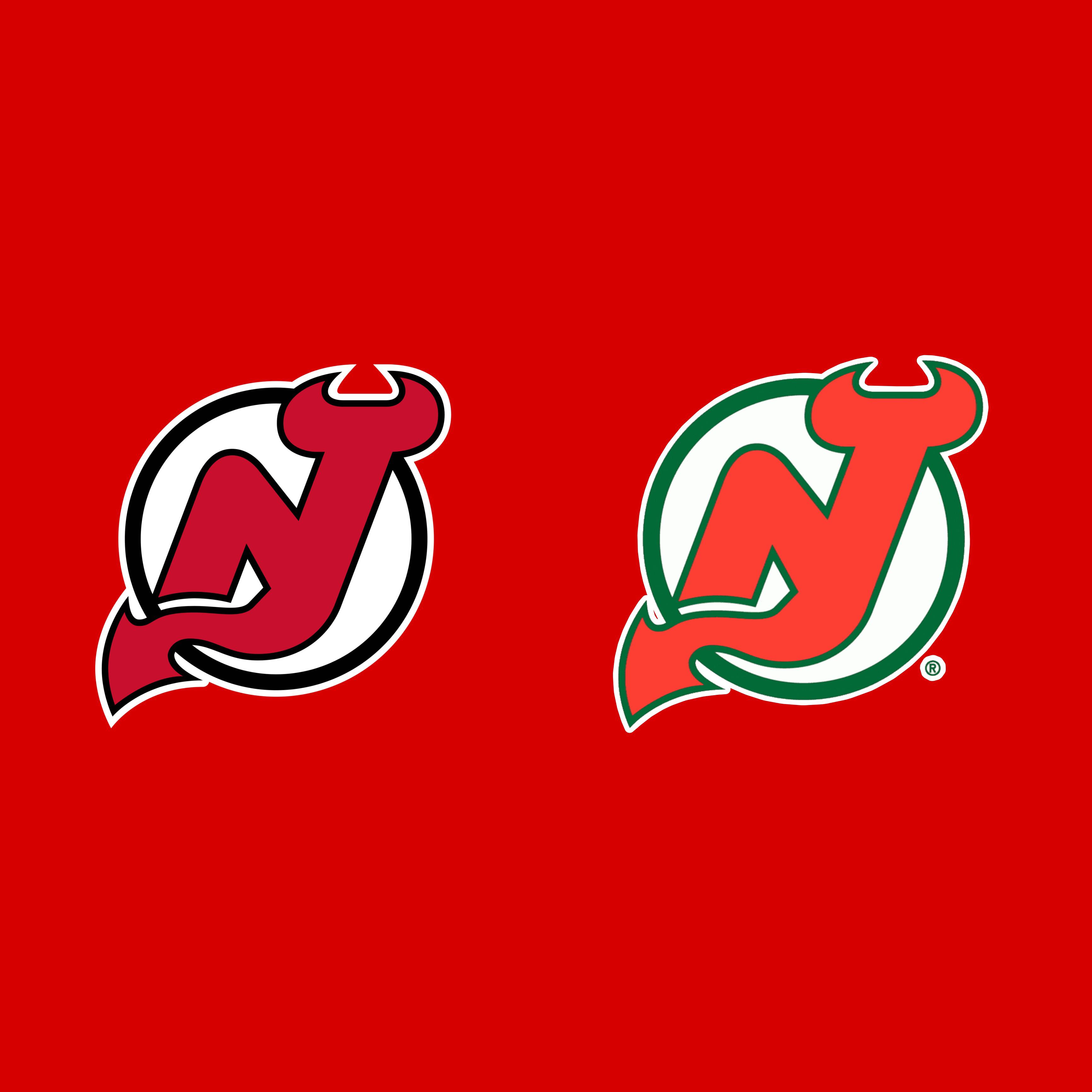
That’s not to say that the black one is bad. It isn’t. There’s just so many black and red teams in the NHL especially in the eastern conference. And zero teams in the east have any form of green in their uniforms minus the maple leafs for st Patrick’s day.
The devils need to embrace green over black. Would be a lot more unique.
Remarkable_Desk_7881
They’re both racist somehow.
Shiny_Mew76
Wait they switched back to the green? I prefer the green more!
CrewMemberNumber6
The green one looks like they ran out of ink to get the black, black. Black is crisp and clean.
EmperorXerro
Left. The Devils jersey slaps. It’s light ears ahead of the Christmas jersey.
scumbagstaceysEx
The green will always be better because this poster existed and we all had it on our wall as 80s kids:
Gotta do forest green if you’re gonna go green. It makes a more unique color combo and pays homage to the Pine Barrens the Jersey Devil lives in
ManMadeChickenNugg
The right bothers my eyes for some reqson
Teal-Tiger-31
The green will always hold a special place in my heart. I’d like them to use all three in their logo. Keep the NJ red, the NJ outline black, and make the outer circle green.
skijjy13
I honestly prefer the red and green
ruinedbyconversation
If you’re colour blind there’s no difference
BrewMan13
Red & black is a classic combo, so gotta go left.
LeMeJustBeingAwesome
Red and Black, Green never made sense for the Devil’s identity.
dbag3o1
Red and green because it’s Christmas and if you rearrange the letters in Santa, it’s Satan. Devils.
llandar
The right looks like a regional pizza franchise.
IsstvanIII
The red n green jerseys are much nicer
Party_Bad7741
Left
Cheetomask
Right all day! Love the way green and red look together, with the white jerseys too it looks great!


25 Comments
Left for sure
Green
Green 100%. But since when is the green new?
Green.
That’s not to say that the black one is bad. It isn’t. There’s just so many black and red teams in the NHL especially in the eastern conference. And zero teams in the east have any form of green in their uniforms minus the maple leafs for st Patrick’s day.
The devils need to embrace green over black. Would be a lot more unique.
They’re both racist somehow.
Wait they switched back to the green? I prefer the green more!
The green one looks like they ran out of ink to get the black, black. Black is crisp and clean.
Left. The Devils jersey slaps. It’s light ears ahead of the Christmas jersey.
The green will always be better because this poster existed and we all had it on our wall as 80s kids:
https://images.app.goo.gl/MCUrNXhfxZgucs2f6
Green no doubt
Old looks like fucking Christmas so I’m going new
New no doubt
Gotta do forest green if you’re gonna go green. It makes a more unique color combo and pays homage to the Pine Barrens the Jersey Devil lives in
The right bothers my eyes for some reqson
The green will always hold a special place in my heart. I’d like them to use all three in their logo. Keep the NJ red, the NJ outline black, and make the outer circle green.
I honestly prefer the red and green
If you’re colour blind there’s no difference
Red & black is a classic combo, so gotta go left.
Red and Black, Green never made sense for the Devil’s identity.
Red and green because it’s Christmas and if you rearrange the letters in Santa, it’s Satan. Devils.
The right looks like a regional pizza franchise.
The red n green jerseys are much nicer
Left
Right all day! Love the way green and red look together, with the white jerseys too it looks great!
Old