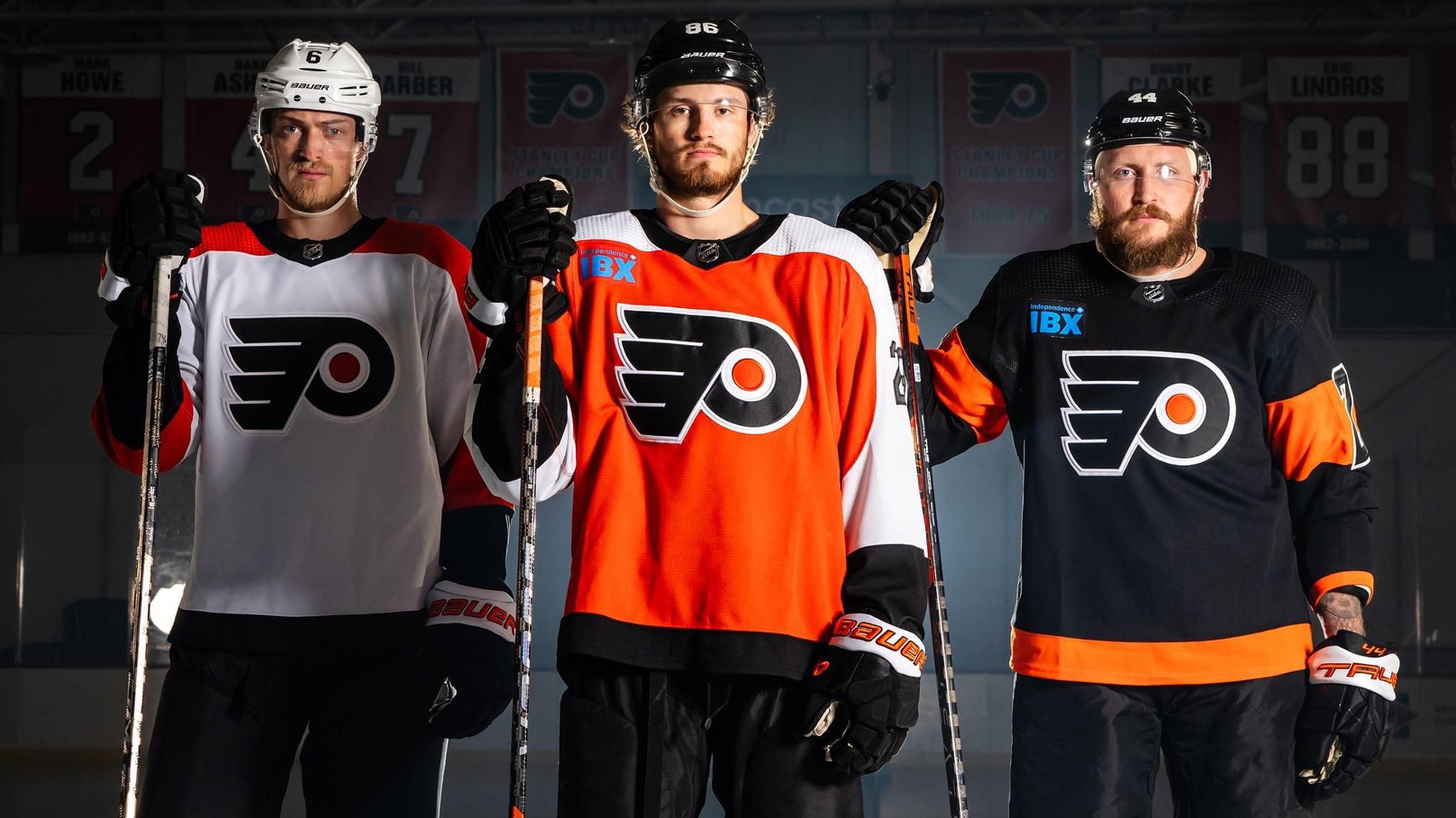
Honestly the blue looks cool on the black jersey but I feel like it’s one of those things that after the first time you see it you’re just gonna be annoyed by it.
khutuluhoop
Those already belonged in the trash before the ridiculous blue logo
TheRitalinCommando
Won’t be long and hockey will look like nascar with all the ads they’re putting on people.
Dewey707
Is it just an illusion or did they darken the orange on home/away but keep the old orange on the black jersey?
136AngryBees
I don’t know what it is, and I feel like these are fanatic designed, but just everything about them looks so …cheap and uninspired.
BubbaSpanks
One word….unimpressive…..fire whoever came up with this crap
Havoc_XXI
Maybe it’ll make them more aerodynamic when they skate…
These ads shouldn’t be on the sweaters but if they are, put them down at the bottom or something.
davesnotonreddit
Is that bright blue the reason they adjusted their shade of orange?
Several-Try4712
I didn’t even notice it. People need to chill, the NHL needs the money to grow and compete. Otherwise it won’t ever grow.
distancetomars
Why don’t companies just adjust their logo to match the jersey?
For example, Montreal has RBC, and instead of matching the blue to the Montréal Canadiens blue, they are different blues…
IEC21
Oh god.
DanTreview
The expression on Sanheim, Farabee, and Deslauriers speaks for us all
vanbboy22
The need the black piping, two color sleeve numbers and the black jersey…..🤮
freeride907
iTs JuSt ThE hElMeTs.
Sneacler67
Little Caesars vibes
Freedom_prime72
I HATE jersey ads!!!
JasonHanky
It’s hilarious how none of these are black or white.
JoeBethersonton50504
It’s crazy to me that they don’t require the ads to confirm to the jersey colors.
The Mets went through something similar earlier this year with a hideous ad in red/white on jerseys with a blue/orange color scheme. Thankfully they adjusted the ads to match the color scheme and then it wasn’t that bad anymore.
goneballisticagain
“Fans should be happy about the ads because they make it so that the multi millionaire players and the billionaire owners make more money”. 👍👍👍
InboundsOrlovsky
The San Diego Motorolas would like a word…
Only-Worldliness2364
Just like the green TD logo on the black Canucks jerseys 🖕
Particular_Tutor_46
Looks ridiculous. The adds should at least maintain the color scheme of the jersey…
JerbearCuddles
That ad really takes a giant dump on what would have been really clean jerseys. Lol.
Tampadarlyn
Blue on orange or red is a marketing faux pas anyway. Put white around the lettering at least. (At this point, they’ve already jacked the look, why not make it readable?)
frankrocksjesus
Zzz….
upvotegoblin
Of course they had to pick the brightest and ugliest color match to the uniform to make sure everyone sees their stupid shithole ad stand out
stinkfingerdude
I’d rather ticket prices double than ads on jerseys
Jwroth
Flyers jerseys never look new
Judge_Rhinohold
Why can’t they make it black on orange and orange on black? Wouldn’t be so jarring.
huejass5
They should at least be the same color scheme as the jerseys
azasinner
Yes, because this will make me buy their product. 100%
fjordperfect123
In 30 years there will be ads on everything. Look at a picture of Times Square in New York in 1910. It’s a bunch of buildings. Look at it now it’s all screens on top of screens.
A tiny ad at the corner of the jersey is the good old days. Enjoy it now.
Just-Concentrate-477
The white jersey looks great
TiredReader87
I like them apart from said hideous ad
dr_freeloader
Why are 2 hockey players and a fat guy in an Irritable Bowel Xtreme medication ad?
BrodyCanuck
NHL is a circus now. Ads everywhere on the ice, the boards change advertisements on TV, constant gambling ads, the brutal questionable reffing. The league sold out, its a business first, sport second.
HeBeGB77
In other news, Reddit mods organize a blackout of the Flyers until advertisements are removed from their jerseys. All Flyers posts must contain a picture of Sylvester Stallone as Rocky Balboa running up the steps to the Museum of Art.
Grady__Bug
Honestly, didn’t even notice the advertisement until this post. And I’m a pens fan. I love finding things to shit on the flyers about. But y’all really do get offended by the most minor things.
elcabeza79
Those are new other than the ugly ad? Okay.
FallingTitans
When fans buy the jersey the AD is on them? that would cause many to just not buy. I wouldn’t that looks terrible!


41 Comments
Ads ruins everything
Honestly the blue looks cool on the black jersey but I feel like it’s one of those things that after the first time you see it you’re just gonna be annoyed by it.
Those already belonged in the trash before the ridiculous blue logo
Won’t be long and hockey will look like nascar with all the ads they’re putting on people.
Is it just an illusion or did they darken the orange on home/away but keep the old orange on the black jersey?
I don’t know what it is, and I feel like these are fanatic designed, but just everything about them looks so …cheap and uninspired.
One word….unimpressive…..fire whoever came up with this crap
Maybe it’ll make them more aerodynamic when they skate…
These ads shouldn’t be on the sweaters but if they are, put them down at the bottom or something.
Is that bright blue the reason they adjusted their shade of orange?
I didn’t even notice it. People need to chill, the NHL needs the money to grow and compete. Otherwise it won’t ever grow.
Why don’t companies just adjust their logo to match the jersey?
For example, Montreal has RBC, and instead of matching the blue to the Montréal Canadiens blue, they are different blues…
Oh god.
The expression on Sanheim, Farabee, and Deslauriers speaks for us all
The need the black piping, two color sleeve numbers and the black jersey…..🤮
iTs JuSt ThE hElMeTs.
Little Caesars vibes
I HATE jersey ads!!!
It’s hilarious how none of these are black or white.
It’s crazy to me that they don’t require the ads to confirm to the jersey colors.
The Mets went through something similar earlier this year with a hideous ad in red/white on jerseys with a blue/orange color scheme. Thankfully they adjusted the ads to match the color scheme and then it wasn’t that bad anymore.
“Fans should be happy about the ads because they make it so that the multi millionaire players and the billionaire owners make more money”. 👍👍👍
The San Diego Motorolas would like a word…
Just like the green TD logo on the black Canucks jerseys 🖕
Looks ridiculous. The adds should at least maintain the color scheme of the jersey…
That ad really takes a giant dump on what would have been really clean jerseys. Lol.
Blue on orange or red is a marketing faux pas anyway. Put white around the lettering at least. (At this point, they’ve already jacked the look, why not make it readable?)
Zzz….
Of course they had to pick the brightest and ugliest color match to the uniform to make sure everyone sees their stupid shithole ad stand out
I’d rather ticket prices double than ads on jerseys
Flyers jerseys never look new
Why can’t they make it black on orange and orange on black? Wouldn’t be so jarring.
They should at least be the same color scheme as the jerseys
Yes, because this will make me buy their product. 100%
In 30 years there will be ads on everything. Look at a picture of Times Square in New York in 1910. It’s a bunch of buildings. Look at it now it’s all screens on top of screens.
A tiny ad at the corner of the jersey is the good old days. Enjoy it now.
The white jersey looks great
I like them apart from said hideous ad
Why are 2 hockey players and a fat guy in an Irritable Bowel Xtreme medication ad?
NHL is a circus now. Ads everywhere on the ice, the boards change advertisements on TV, constant gambling ads, the brutal questionable reffing. The league sold out, its a business first, sport second.
In other news, Reddit mods organize a blackout of the Flyers until advertisements are removed from their jerseys. All Flyers posts must contain a picture of Sylvester Stallone as Rocky Balboa running up the steps to the Museum of Art.
Honestly, didn’t even notice the advertisement until this post. And I’m a pens fan. I love finding things to shit on the flyers about. But y’all really do get offended by the most minor things.
Those are new other than the ugly ad? Okay.
When fans buy the jersey the AD is on them? that would cause many to just not buy. I wouldn’t that looks terrible!