I don’t like the Vs but I like all the old ones a lot actually
TrevolutionNow
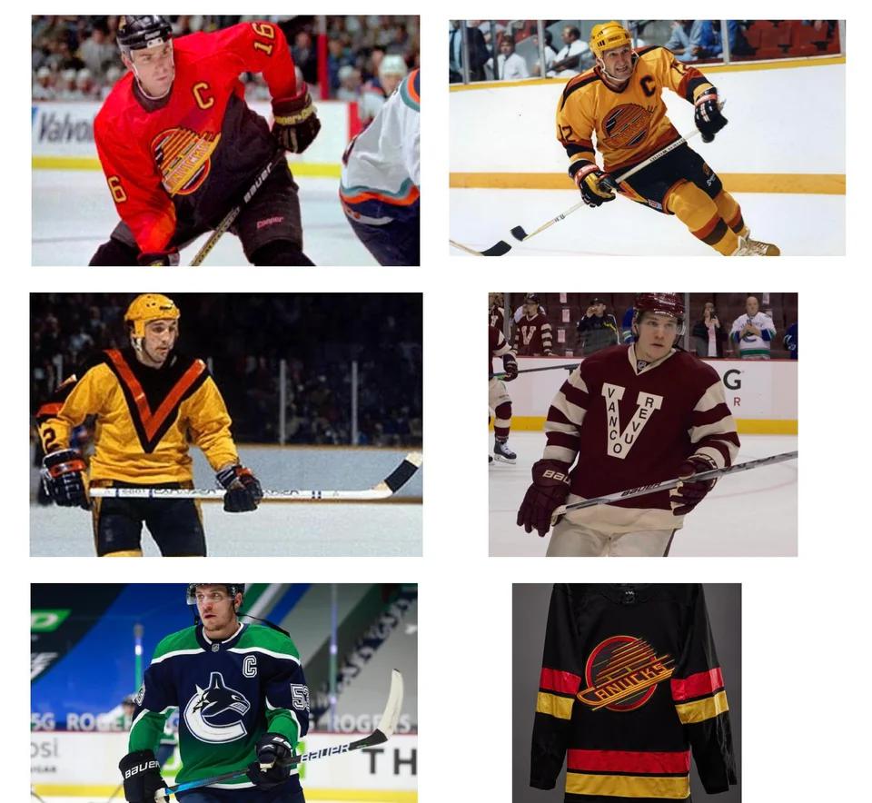
Top right. The Yellow V is iconic. The top right jersey has that ridiculous color scheme without the charm.
schmokeabutt
V of shame for sure
Pongfarang
Vancouver has so many to choose from if you are looking for awful. Anything they did with red black and gold was the worst though. The orca and the old timey hockey stick logos are better. And the skating lumberjack is awesome.
Moriroku
Yellow V
JasonPlattMusic34
Trick question; it’s all of them 🤮 never cared for the skate look
M888887777
I loved that O’Henry peanut butter one up in the top corner when I was a kid. I think I still like it
Zealousideal-Beat784
How did the middle left one ever exist and who thought it was a good idea?
LuckyMe_13
Canucks are awful all the way around but the big V is just heinous and uncalled for.
rethrast
Sprite can
DabsDoctor
Yes
rullarzutt
The Millionaires jerseys are great, too bad we’ve lost like every game in them
herraJohansson
The picture, all
protein_extremist
the yellow V
SkynetKiller666
The “Vraenvcuo” one
Top_Sausage69
The buffalo slug
LastoftheSummerWine
You could change the word franchise to league and still keep that same set of images.
HockeyBabble
LA Kings
The Burger King sweater 1995-96
Sorry
Salmon_Slayer1
Only great jersey is the original hockey stick. Rest suck.
Leafs6991
All are beautiful
Devo198989
Am I the only one that thinks all of these are fire?
Melodic-Bug-9022
None listed. The worst was the really dark blue to burnt red gradient. Followed by anything else with the C ejaculating the orca
Sensitive_Mousse_445
The Vancouver jersey looks like a prison uniform. Playing for them probably feels like being in a prison too
Pretend-Cow2516
Those reverse retros are brutal. The maroon, blue and silver version it’s replicating was better but color fade jerseys are just wack always.
Edit: the two on the bottom right are beautiful. Also, as a wings fan, yes, I know our RR’s the first year were ugly as hell. Our worst in team history.
thecoolerllcoolJ
That bottom left one is an absolute beut to me.
Stockton20969
Canucks really do have the ugliest jersey history in the league.
TsarOfSaturn
Middle right. Just screams college to me
EyeHeartBidets
Folks love to shit on Vancouver’s Flying V jerseys but apparently y’all need to take a closer look at literally ANY Seals/Golden Seals jerseys
spaceporter
So we agree that the six ugliest jerseys in NHL history are all Canucks jerseys?


36 Comments
The yellow and black stuff.
That yellow V, oy yoy yoy.
middle, left
The yellow V looks like a star trek uniform
The flying V.
The yellow V
The blue > green gradient 🤢
Bottom right is absolutely elite
I don’t like the Vs but I like all the old ones a lot actually
Top right. The Yellow V is iconic. The top right jersey has that ridiculous color scheme without the charm.
V of shame for sure
Vancouver has so many to choose from if you are looking for awful. Anything they did with red black and gold was the worst though. The orca and the old timey hockey stick logos are better. And the skating lumberjack is awesome.
Yellow V
Trick question; it’s all of them 🤮 never cared for the skate look
I loved that O’Henry peanut butter one up in the top corner when I was a kid. I think I still like it
How did the middle left one ever exist and who thought it was a good idea?
Canucks are awful all the way around but the big V is just heinous and uncalled for.
Sprite can
Yes
The Millionaires jerseys are great, too bad we’ve lost like every game in them
The picture, all
the yellow V
The “Vraenvcuo” one
The buffalo slug
You could change the word franchise to league and still keep that same set of images.
LA Kings
The Burger King sweater 1995-96
Sorry
Only great jersey is the original hockey stick. Rest suck.
All are beautiful
Am I the only one that thinks all of these are fire?
None listed. The worst was the really dark blue to burnt red gradient. Followed by anything else with the C ejaculating the orca
The Vancouver jersey looks like a prison uniform. Playing for them probably feels like being in a prison too
Those reverse retros are brutal. The maroon, blue and silver version it’s replicating was better but color fade jerseys are just wack always.
Edit: the two on the bottom right are beautiful. Also, as a wings fan, yes, I know our RR’s the first year were ugly as hell. Our worst in team history.
That bottom left one is an absolute beut to me.
Canucks really do have the ugliest jersey history in the league.
Middle right. Just screams college to me
Folks love to shit on Vancouver’s Flying V jerseys but apparently y’all need to take a closer look at literally ANY Seals/Golden Seals jerseys
So we agree that the six ugliest jerseys in NHL history are all Canucks jerseys?