They had that maui and sons shark before eh current one is sick!
goompa88
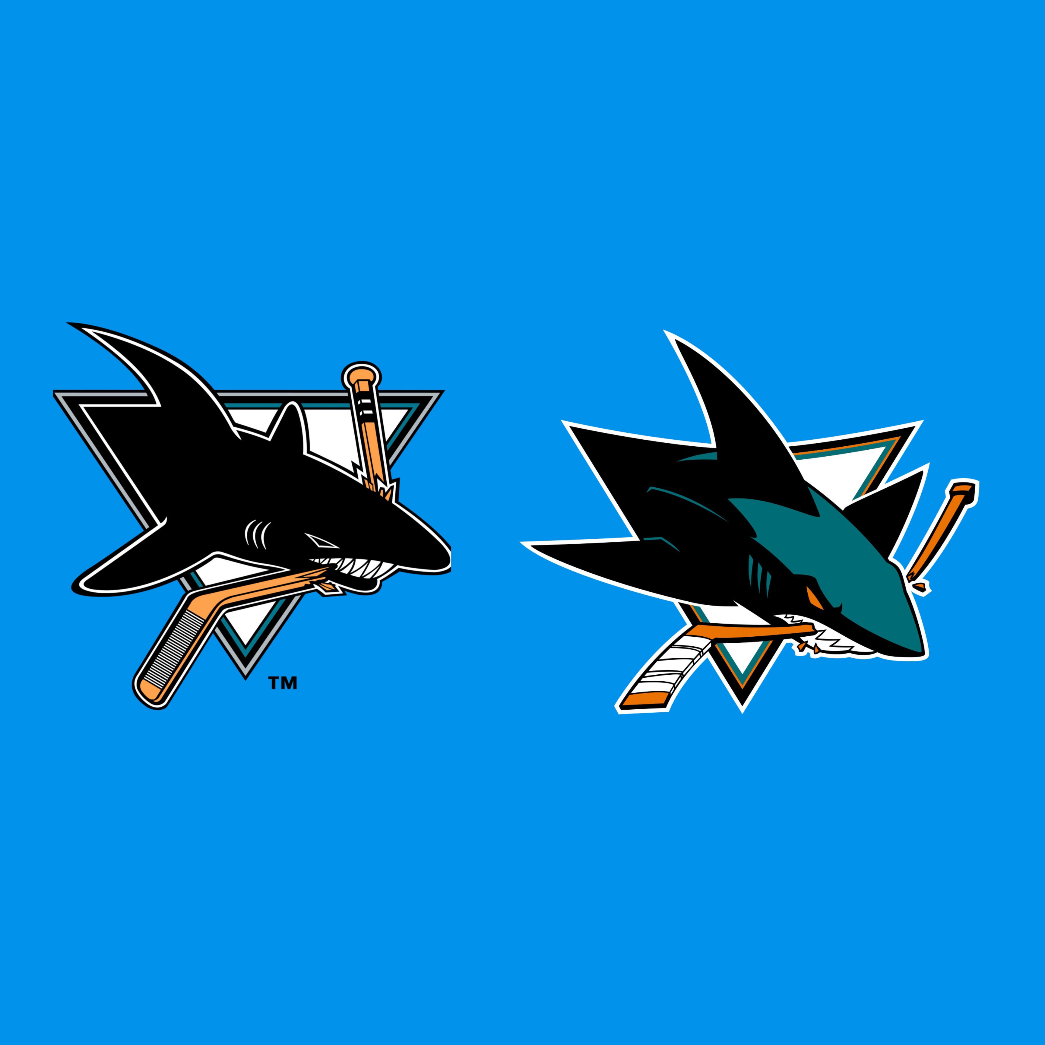
Old
smoothvermooth
The old one looks like it was drawn by a 9 year old who is into hockey but not drawing
Lance_E_T_Compte
New
ChesterCheevo
As a Sharks fan, I’ve grown to hate the new logo. I wish we’d go full-time to the OG!
MissionSequence
I wouldn’t even call it a “new” logo, it’s more of a glow up on the old one
Charmegazord
I hate break this everyone, but this logo is a Mandela effect candidate.
I SWEAR there was a grey and teal Sharks logo with eyes colored in in the 90,s, specifically 93-95
therealphoodie
Both are amazing, but I prefer the new one. I like the teal on the shark in that one
that-bro-dad
Honestly they’re both pretty dope but I think I like the new one slightly more
FreshOverTheBorder
I dig the new one. I think it’s an improvement. Especially color wise
lego_mannequin
The fins on the old one are comically bad LOL.
F00Manchu
Both work
Boboar
This is how you redesign a logo imo. A perfect update to one of the best logos already.
NY-Black-Dragon
Definitely prefer the new logo, but I can honestly go either way on the silver vs. orange debate.
bwoah07_gp2
The new logo because the old logo is one of those old sports logo that looks outdated.
For example Washington’s 90’s Screaming Eagle logo could still fit today and they should switch back to it. But I couldn’t say that about the 90’s Sharks logo.


45 Comments
New, that old logo is awful
Old logo looks like something a 7 year old would draw but the new logo is much better
Old one looks scarier. Something about those eyes.
New one has cooler colors, looks more cartoony and less scary.
I prefer the one where he’s choking on the stick
Have to go New one 🦈🦈🦈
All I know is those original Sharks jerseys were phenomenal
New. But I think of Batman every time is see it.
I like the new logo, but wish it used a straight triangle like the old logo.
New
Old one reminds me of the old Carolina Panthers logo. The new one is def an upgrade.
I like the old one, it’s more slick than the other one. The monochrome and straight lines just look good together.
New one, by a mile. 😛
I never liked how on the old logo, the tape on the stick blade never wrapped around it.
Best new logo in the league, and I say that as a Kings fan.
old
New
I like the design of the left one but wish it had the teal of the right one.
New
New is just more polished and I love it
i have a sharks duffle bag with the old logo on it from the mid 90s lol
Have an original jersey still so that’s it
Old
Old. Lines are pure.
New is flat out a better version of the old one
New
I love how they hid the SJ in their logo
Not enough cocaine in either logo
The new logo is best regular logo in the league and their third with the [tail](https://content.sportslogos.net/logos/1/26/full/nc08flqzjyftfftmh3in.png) is even better
I love both
New for sure
They had that maui and sons shark before eh current one is sick!
Old
The old one looks like it was drawn by a 9 year old who is into hockey but not drawing
New
As a Sharks fan, I’ve grown to hate the new logo. I wish we’d go full-time to the OG!
I wouldn’t even call it a “new” logo, it’s more of a glow up on the old one
I hate break this everyone, but this logo is a Mandela effect candidate.
I SWEAR there was a grey and teal Sharks logo with eyes colored in in the 90,s, specifically 93-95
Both are amazing, but I prefer the new one. I like the teal on the shark in that one
Honestly they’re both pretty dope but I think I like the new one slightly more
I dig the new one. I think it’s an improvement. Especially color wise
The fins on the old one are comically bad LOL.
Both work
This is how you redesign a logo imo. A perfect update to one of the best logos already.
Definitely prefer the new logo, but I can honestly go either way on the silver vs. orange debate.
The new logo because the old logo is one of those old sports logo that looks outdated.
For example Washington’s 90’s Screaming Eagle logo could still fit today and they should switch back to it. But I couldn’t say that about the 90’s Sharks logo.