Would love if they would play the last games with these logos now
Iliketomeow85
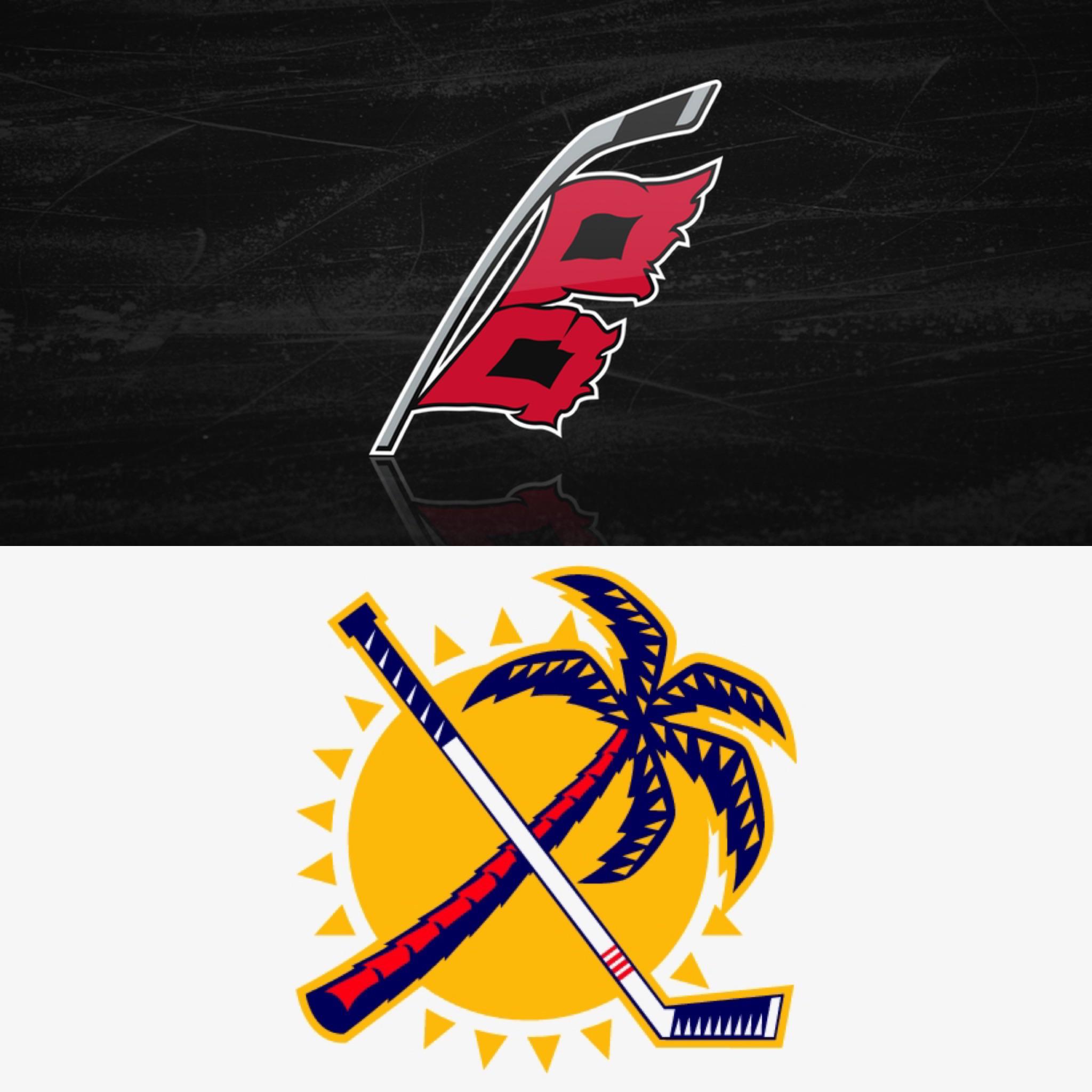
The Florida one is cool, Canes is definitely one of the logos of all time
randomguy041285
Let’s agree to disagree
Rudytootiefreshnfty
100000% agree
sarahmichelef
The Canes thirds are actually my fave jersey, full stop.
mb25sf
Great conference finals for hockey no matter who makes it in the West. All newer, high growth, non-traditional markets. Great for the kids in those markets, nothing like NHL playoffs.
GlitteredRoomForView
The Canes were using the alternate as their regular home jersey this season. But in the playoffs went to this seasons alternate (2006 design) full time
bippityboppityzopp
Meh, there are better logos.
OpaMils
Canes black jerseys > their red jerseys
Chewie_i
The storm flag should have stayed as a shoulder patch. No idea why they put that as their main crest
Ketachloride
if they named them the Burricanes this logo would be great
jListoo
Florida’s logo looks like a minor league team, it’s not it.
BartleBossy
ITT: People who dont understand what the word “Alternate” means
7-11-inside-job
They’re cool– but if these are the “best”, all the logos must really suck.
Submersedelm
These two logos perfectly embody climate of the Southeastern United States; gorgeous and tropical, but could also blow your whole home away in one storm.
boat-
Not a fan of these logos. The Carolina one is a cool concept with the warning flags, but to me it looks so much like the letter “B,” which just doesn’t fit at all.
And crossing a palm tree with a hockey stick is just too unsymmetrical and awkward IMO.
mattcojo2
That reverse retro jersey for the panthers is so slick. I want to get a Bobby Lu one so bad.
Sea_Bad_3480
Can someone explain the hurricanes logo to me?? Looks like a “B” to me
fortworthbret
That hurricanes secondary logo is second to none.
​
nice touch on North Carolina represented in the space between them.
​
​
that said, on my Hurricanes sweater (old) there is only one flag flying. Isn’t that just a “storm warning”?
Bayoffun
The Florida one is pretty cool. The canes one though……no.
782Sportscards
That’s a take
rlb_714
I wish both teams would use these logos more. They look good.
brickwall1339
I’m just glad Carolina finally fixed their logo from the Tropical Storm Warning flag to the Hurricane Warning a couple years ago.
TornDig
One would need to mention if their trying to grow the game and it’s one game on a Sunday and playoff at that , maybe start the game at a reasonable time like say 3pm pacific time so kids could actually watch it on the east and central time zones especially on a school night to start a game at 9-10 on east and central coast is not trying to get the younger generations involved.. just saying
Simmons54321
I wish the Canes flags were a bit more “logo” like. Something about how they’re kinda jagged and asymmetrical bugs me


25 Comments
Would love if they would play the last games with these logos now
The Florida one is cool, Canes is definitely one of the logos of all time
Let’s agree to disagree
100000% agree
The Canes thirds are actually my fave jersey, full stop.
Great conference finals for hockey no matter who makes it in the West. All newer, high growth, non-traditional markets. Great for the kids in those markets, nothing like NHL playoffs.
The Canes were using the alternate as their regular home jersey this season. But in the playoffs went to this seasons alternate (2006 design) full time
Meh, there are better logos.
Canes black jerseys > their red jerseys
The storm flag should have stayed as a shoulder patch. No idea why they put that as their main crest
if they named them the Burricanes this logo would be great
Florida’s logo looks like a minor league team, it’s not it.
ITT: People who dont understand what the word “Alternate” means
They’re cool– but if these are the “best”, all the logos must really suck.
These two logos perfectly embody climate of the Southeastern United States; gorgeous and tropical, but could also blow your whole home away in one storm.
Not a fan of these logos. The Carolina one is a cool concept with the warning flags, but to me it looks so much like the letter “B,” which just doesn’t fit at all.
And crossing a palm tree with a hockey stick is just too unsymmetrical and awkward IMO.
That reverse retro jersey for the panthers is so slick. I want to get a Bobby Lu one so bad.
Can someone explain the hurricanes logo to me?? Looks like a “B” to me
That hurricanes secondary logo is second to none.
​
nice touch on North Carolina represented in the space between them.
​
​
that said, on my Hurricanes sweater (old) there is only one flag flying. Isn’t that just a “storm warning”?
The Florida one is pretty cool. The canes one though……no.
That’s a take
I wish both teams would use these logos more. They look good.
I’m just glad Carolina finally fixed their logo from the Tropical Storm Warning flag to the Hurricane Warning a couple years ago.
One would need to mention if their trying to grow the game and it’s one game on a Sunday and playoff at that , maybe start the game at a reasonable time like say 3pm pacific time so kids could actually watch it on the east and central time zones especially on a school night to start a game at 9-10 on east and central coast is not trying to get the younger generations involved.. just saying
I wish the Canes flags were a bit more “logo” like. Something about how they’re kinda jagged and asymmetrical bugs me