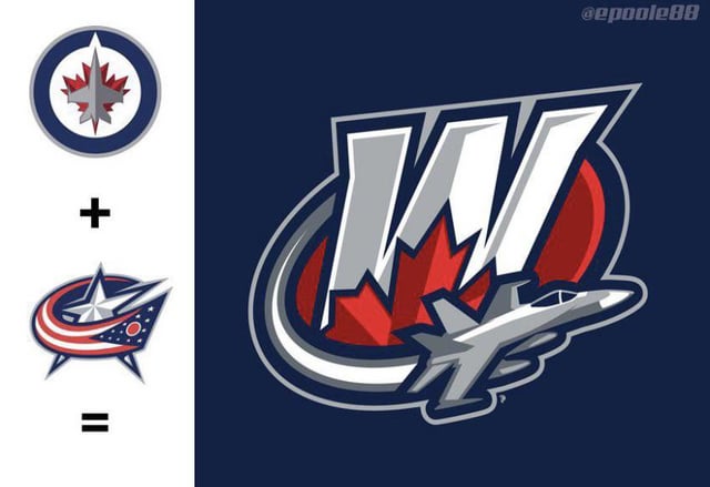
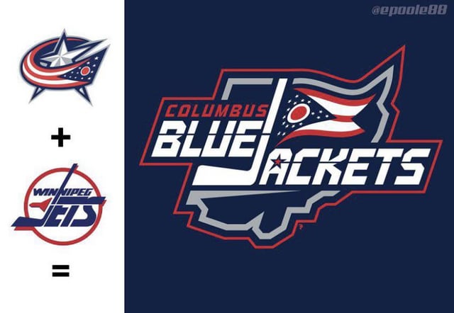
Winnipeg Jets hybrid logos with the Blue Jacketsby ColePerfettiFan Central DivisionWestern ConferenceWinnipeg Jets Prev Post I wanted something to bring to the game in Ottawa so I made the AL The Octopus 🐙 January 24, 2023 Next Post Kasperi Kapanen on the ice before Pittsburgh Penguins skate 1/24/23 January 24, 2023 16 Comments ColePerfettiFan 3 years ago Credit to u/Got-cancelled from r/nhl BodybuilderMajor1260 3 years ago Honestly looks so cool! I would totally love to see this on the Winnipeg jersey 599Ninja 3 years ago That actually goes really hard Spencie-cat 3 years ago Plane. thelochteedge 3 years ago Super cool concepts. I know a lot of people find these to be blasphemous but I think they look cool. Angry_Canada_Goose 3 years ago The Columbus logo looks 10x better than their current logo. bobcatsandy 3 years ago I love the Columbus, Manitoba Jet-Jackets bytheseine 3 years ago Need it with the F35 instead of F18 RimpleSimpsk1n 3 years ago Sum ov dat Hockey_socks 3 years ago Thanks, I hate it. Vaklaruush 3 years ago Almost a Jets/Blue Bombers jersey. The first one that is. Patttybates 3 years ago This logo is 500% better than our regular logo. daveymick 3 years ago I just love how random the idea is. ronwharton 3 years ago first one looks pretty cool-Ron Wharton minertime_allthetime 3 years ago I could see this being the logo for a Winnipeg minor hockey team, it looks good tropicana4200 3 years ago These are both pretty dope!Write A CommentYou must be logged in to post a comment.
BodybuilderMajor1260 3 years ago Honestly looks so cool! I would totally love to see this on the Winnipeg jersey
thelochteedge 3 years ago Super cool concepts. I know a lot of people find these to be blasphemous but I think they look cool.
minertime_allthetime 3 years ago I could see this being the logo for a Winnipeg minor hockey team, it looks good


16 Comments
Credit to u/Got-cancelled from r/nhl
Honestly looks so cool! I would totally love to see this on the Winnipeg jersey
That actually goes really hard
Plane.
Super cool concepts. I know a lot of people find these to be blasphemous but I think they look cool.
The Columbus logo looks 10x better than their current logo.
I love the Columbus, Manitoba Jet-Jackets
Need it with the F35 instead of F18
Sum ov dat
Thanks, I hate it.
Almost a Jets/Blue Bombers jersey. The first one that is.
This logo is 500% better than our regular logo.
I just love how random the idea is.
first one looks pretty cool
-Ron Wharton
I could see this being the logo for a Winnipeg minor hockey team, it looks good
These are both pretty dope!