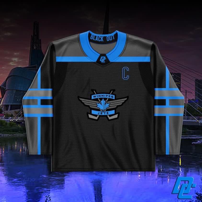
Maybe it’s because I’ve had a few beers tonight but I like it!
Garret1234
I don’t like it
fdisfragameosoldiers
I love how the logo looks! But maybe needs some tweeks. Can’t put my finger on what it needs though.
Taddy_Mason_22
Not enough contrast.
Soft_Remote_9269
Look like Vegas
RonnieMak
Absolutely Not. 1. Logo is garbage.Of all the possible options you chose the one that barely is good enough to be put on stationary. 2. We don’t have a captain so why go there. 3.Just too busy with all that blue. Swap the blue with more black a chuck a Jets circle logo on it and you might have something.
Bighomiequan99
Less grey. Besides that I like it a lot. They gotta use that logo eventually


7 Comments
Maybe it’s because I’ve had a few beers tonight but I like it!
I don’t like it
I love how the logo looks! But maybe needs some tweeks. Can’t put my finger on what it needs though.
Not enough contrast.
Look like Vegas
Absolutely Not. 1. Logo is garbage.Of all the possible options you chose the one that barely is good enough to be put on stationary.
2. We don’t have a captain so why go there.
3.Just too busy with all that blue.
Swap the blue with more black a chuck a Jets circle logo on it and you might have something.
Less grey. Besides that I like it a lot. They gotta use that logo eventually