
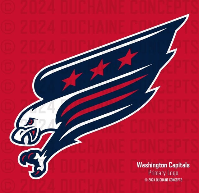
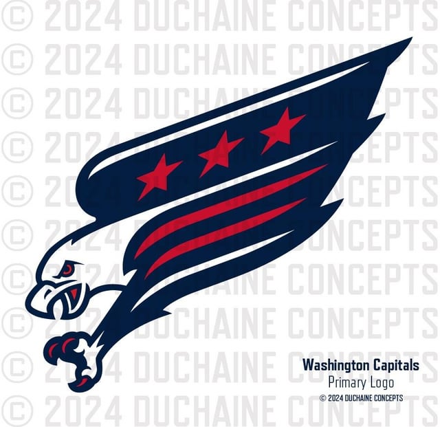
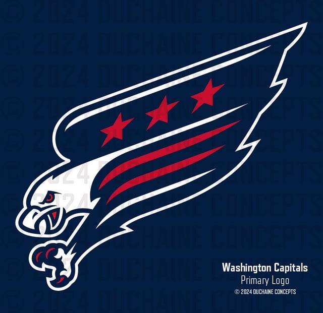
I’m back, babes. Thanks for everybody’s feedback on the original Modern Screagle. Naturally, there were some things that bothered the hell out of me from the second I posted it, so I thought I’d give it another go. Is it perfect? Absolutely not. The Screagle has a generally awkward shape that may always feel a little dated, a relic from a time where if you wanted to give a graphic some attitude, you’d put the whole damn thing in italics. That said, I still think the Screaming Eagle is the strongest logo the Caps have ever used. I’d be stoked to see some iteration come back full-time. Cheers and don’t be suck.
by Positive-Mud-8262


4 Comments
This is great, and I’d be a buyer of a White Screagle jersey if this was the primary.
Would be really cool if the mouth or claw included the Capital Building silhouette similar to the Weagle logo. **Nice Work!!!**
I know nothing about graphic design, but maybe have the head further right, giving it more of a diagonal with the wing and the talon. I don’t know how this would affect the rest of the design
I like it
Did you delete your previous one? I wanted to see them side by side. But this shape seems better – this one looks much less like a chubbier baby screagle. I’m a fan! I’d be happy to see this get used officially.