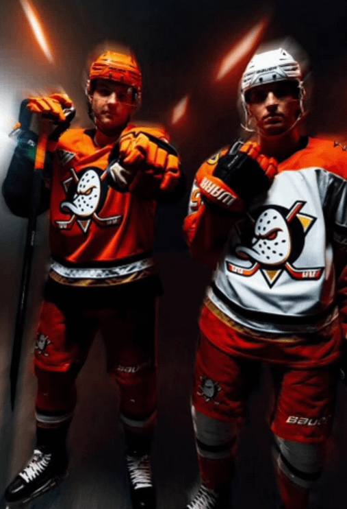
I think this is a very convincing AI image/photoshop. Here’s my reasoning:
1. The eye on the home jersey has changed to gold (unless that’s how it’s supposed to be).
2. The patch on the away jersey in the top right seems to fade into nothingness.
3. The webbed D patches don’t look any better than they are currently.
4. The glove of the player pointing at the screen (is that Fowler?) is all wonky. AI is very bad when it comes to separating fingers and creating hands.
5. What’s going on with the stick? It just disappears…
6. I’m not an expert on pro skates, but those skates don’t look “pro” to me. They look like the standard skates I had from the early 2000s.
7. I feel like I’m taking crazy pills when I look at the players. The guy on the right has a 9 on his jersey, but that could either be Max Jones, Ben Meyers, or Troy Terry. He doesn’t look like any of them. Wouldn’t you want your top players to sport the new look? (Zegras, McTavish, Carlsson, etc.)
HammerOfHephaestus
Like the home. Don’t really like the away. Think it would look better if the orange shoulders didn’t come to the front. But also could just be because of the glove in the way.
YoshiTheBroshi
Gotta be honest, if this real, don’t like it. The edits they made to the logo really throws off the balance of it all.
thatguy_2456
I’ll take it if this is real
Ellite25
Way too much orange imo. Just give the OG colors back. Why is that so hard?
“I’ve seen this photo floating around today but not quite sure what to make of it yet. What I do know is the crest aligns with the redesigned logo I saw.”
garybuesea
Damn now we really look like traffic cones
Infected13
I thought the leak said they would be wearing orange helmets both home and away?
ImWicked39
I like them a lot.
Stryk-Man
As expected, better than the webbed D jersey, but doesn’t come close to the originals. That’s still a win in my book.
LeoCarlsson
do they have the old logo on the pants?
BroLil
I hate the striping and I don’t like the orange shoulders. It’s gonna make Flyers games look awful, especially with the orange pants, and the fact that it’s the exact same orange now…
moussetang
Need purple and green in those jerseys
SupermarketNo4471
think they’re real leaks… I wish they went with all white on the away jerseys .. not a fan of the orange pants or orange shoulders
RBro93
If this is real, I really like it. The kits and logo looks aggressive.
TheAnalogKid18
These look fuckin sick.
MDFan4Life
Ironic, that they wanted to distance themselves from Disney, yet everytime they “rebrand”, the uniforms end up looking rather “cartoony”?
I don’t hate it, but I’m still not sure if I like it?
buckyhermit
I might be in the minority but the shoulder yoke on the white jerseys make me nervous. (I am a non-local fan so I’ll be seeing the white ones a lot.)
Hoping it doesn’t resemble the Flyers.
vicblck24
Like the logo more but the overall uniforms look more like a minor league team
fnut7-
Big if true! Source?
GoPackk
Honestly if these are it I like them. Should’ve went with black helmet and pants on the Home ones but overall can’t complain. The logo looks so good imo
Edit: way way better than what we previously had!!
Skallld
I am not a fan of this look. If it comes to pass, I’ll only be able to think of it as the Creamsicle era.
Eggplant and Jade all the way.
ProfProfessorberg
I hope the eye is orange on the homes and it’s just the lighting making it look yellow/gold
nolander
Reverse retro white and oragne was better but I’ll take the mighty ducks logo being back full time.
Sc00tzy
Too much orange for my taste, we kinda look like a kids hockey team with those imo. 3/10 for me but still better than the foot
ChesterButternuts
Looks like the white RR is still my favorite. I hate those orange shoulders.


33 Comments
i dont see how this cant be real. everything lines up. including the ad patch
Looks like a combo of AI and photoshop.
No way that isn’t just a leak. You’d have to go through so much effort to fake that lol.
I like the home. Not sure I like the orange shoulders on the away. Hard to tell with the lighting though. Logo looks nice though. I like it.
Edit: As someone who has messed around with AI a ton, this does not look like AI.
Edit 2: Decided to ai upscale it for fun since I’ve been working on new ways to upscale.
https://preview.redd.it/kry6z2ozxd7d1.jpeg?width=700&format=pjpg&auto=webp&s=7255e787022c80eb1bfa7cb2bff3c8ed1cdb0b03
I don’t hate this
If this is real, it looks fucking awesome imo
Cam Fowler is in the home. Who is in the away
Dumb questions who is the player on the right?
I think this is a very convincing AI image/photoshop. Here’s my reasoning:
1. The eye on the home jersey has changed to gold (unless that’s how it’s supposed to be).
2. The patch on the away jersey in the top right seems to fade into nothingness.
3. The webbed D patches don’t look any better than they are currently.
4. The glove of the player pointing at the screen (is that Fowler?) is all wonky. AI is very bad when it comes to separating fingers and creating hands.
5. What’s going on with the stick? It just disappears…
6. I’m not an expert on pro skates, but those skates don’t look “pro” to me. They look like the standard skates I had from the early 2000s.
7. I feel like I’m taking crazy pills when I look at the players. The guy on the right has a 9 on his jersey, but that could either be Max Jones, Ben Meyers, or Troy Terry. He doesn’t look like any of them. Wouldn’t you want your top players to sport the new look? (Zegras, McTavish, Carlsson, etc.)
Like the home. Don’t really like the away. Think it would look better if the orange shoulders didn’t come to the front. But also could just be because of the glove in the way.
Gotta be honest, if this real, don’t like it. The edits they made to the logo really throws off the balance of it all.
I’ll take it if this is real
Way too much orange imo. Just give the OG colors back. Why is that so hard?
From ICETHETICS [https://x.com/icethetics/status/1803141703106510914](https://x.com/icethetics/status/1803141703106510914)
“I’ve seen this photo floating around today but not quite sure what to make of it yet. What I do know is the crest aligns with the redesigned logo I saw.”
Damn now we really look like traffic cones
I thought the leak said they would be wearing orange helmets both home and away?
I like them a lot.
As expected, better than the webbed D jersey, but doesn’t come close to the originals. That’s still a win in my book.
do they have the old logo on the pants?
I hate the striping and I don’t like the orange shoulders. It’s gonna make Flyers games look awful, especially with the orange pants, and the fact that it’s the exact same orange now…
Need purple and green in those jerseys
think they’re real leaks… I wish they went with all white on the away jerseys .. not a fan of the orange pants or orange shoulders
If this is real, I really like it. The kits and logo looks aggressive.
These look fuckin sick.
Ironic, that they wanted to distance themselves from Disney, yet everytime they “rebrand”, the uniforms end up looking rather “cartoony”?
I don’t hate it, but I’m still not sure if I like it?
I might be in the minority but the shoulder yoke on the white jerseys make me nervous. (I am a non-local fan so I’ll be seeing the white ones a lot.)
Hoping it doesn’t resemble the Flyers.
Like the logo more but the overall uniforms look more like a minor league team
Big if true! Source?
Honestly if these are it I like them. Should’ve went with black helmet and pants on the Home ones but overall can’t complain. The logo looks so good imo
Edit: way way better than what we previously had!!
I am not a fan of this look. If it comes to pass, I’ll only be able to think of it as the Creamsicle era.
Eggplant and Jade all the way.
I hope the eye is orange on the homes and it’s just the lighting making it look yellow/gold
Reverse retro white and oragne was better but I’ll take the mighty ducks logo being back full time.
Too much orange for my taste, we kinda look like a kids hockey team with those imo. 3/10 for me but still better than the foot
Looks like the white RR is still my favorite. I hate those orange shoulders.