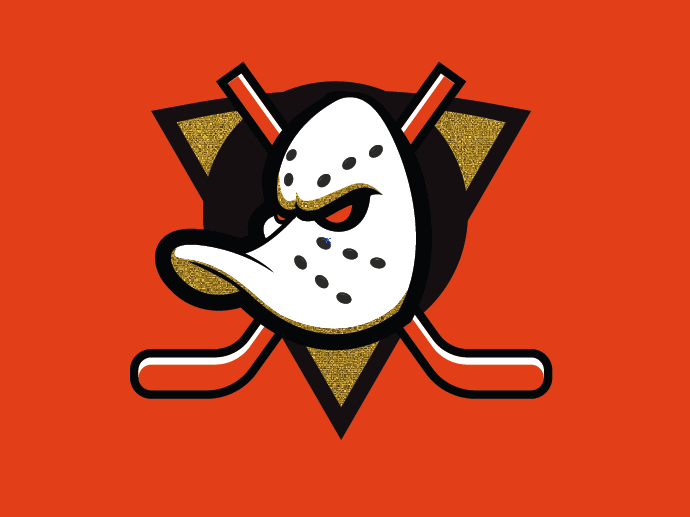
I honestly don’t mind the gold pizza slice, but if it’s VGK material think I’d rather have it as a thin stripe on the sleeves rather than the logo itself. Also not sure how to feel about the gold on the mask too
No-Doctor-4396
There is no way it looks like this.
buddhajames
Whatever the official logo ends up being, I think it’ll grow on us. Gonna be hard to see a different variation of the Mighty logo because we’ve loved the original for decades now.
All told, if we can get something close to this, I’m happy. Yes, it’s not perfect, but anything to avoid a copyright issue with Disney. Maybe they could replace the red with a sky blue or a silver? And maybe make the stick color an old gold color?
Idk. Minor gripes. Could be better and could definitely be a helluva lot worse.
MrDucksworth92

Just with gold lips and eyeliner.
THE-JAMlE
I dont mind the orange eye… looks more menacing… or the gold triangle… but the gold highlights on the mask and the reworked hockey sticks… not a huge fan.
StumptownRetro
This is probably close to what it is. And I don’t really like it that much. Just go back to the OG colour schemes.
Unsound_Science
I’d rather stay with the current abomination if this is the change.
Tight_Ad905
Looks like someone let their kid do arts and crafts on the mighty ducks logo
NE1LS
The thin black line separating the orange stick from the orange jersey is not enough to separate them. On a white jersey, maybe. But orange/black/orange there is hideous.


17 Comments
Well I hate the gold and the hot dogs.
…….
I honestly don’t mind the gold pizza slice, but if it’s VGK material think I’d rather have it as a thin stripe on the sleeves rather than the logo itself. Also not sure how to feel about the gold on the mask too
There is no way it looks like this.
Whatever the official logo ends up being, I think it’ll grow on us. Gonna be hard to see a different variation of the Mighty logo because we’ve loved the original for decades now.
Respectfully… 🤢🤮
Man, the eyebrows really set this thing off.
https://preview.redd.it/sh4k7hb9f86d1.png?width=1080&format=pjpg&auto=webp&s=92ed0266db5ea25baec477990a1a393583a26944
All told, if we can get something close to this, I’m happy. Yes, it’s not perfect, but anything to avoid a copyright issue with Disney. Maybe they could replace the red with a sky blue or a silver? And maybe make the stick color an old gold color?
Idk. Minor gripes. Could be better and could definitely be a helluva lot worse.

Just with gold lips and eyeliner.
I dont mind the orange eye… looks more menacing… or the gold triangle… but the gold highlights on the mask and the reworked hockey sticks… not a huge fan.
This is probably close to what it is. And I don’t really like it that much. Just go back to the OG colour schemes.
I’d rather stay with the current abomination if this is the change.
Looks like someone let their kid do arts and crafts on the mighty ducks logo
The thin black line separating the orange stick from the orange jersey is not enough to separate them. On a white jersey, maybe. But orange/black/orange there is hideous.
This is so fucking cooked man, lmfao

Please stop.