I think the flames should, and the hawks and the flyers. And probably the red wings. The 96-97 canadiens logo is pretty dope as well
Imm0rTALDETHSpEctrE
Snagglepuss forever.
bonz0h
Big time agree with the three you’ve chosen.
My honorary mentions: Buffalo, and although I’m a hawks fan and it kills to say, bring back the old Blues jerseys/logo/color scheme! They are killer
johannesBrost1337
Canucks FOR SURE
Flux_resistor
Isles should. Indifferent to the rest
Gold-Independence-26
For sure. Sabres as well
Gold-Independence-26
Everything about the Ducks right now is horrible: logo, color scheme, unis
Eetkong
Miss that penguins logo
Accurate-Home-3010
Washington and Tampa as well imo
Educational_Bee_4700
Caps 90s logo is elite.
OpinionOwn6727
i do miss the old Panthers logo, but no what the Kings currently have is gold
xizrtilhh
It should be a criminal offence to have the Canucks skate logo on anything except a black or white jersey.
Nice_Wolverine_4641
Had to choose 96-97 eh?
donster217
Your words to Henry and Susan Samueli’s ears.
Emotional_Match8169
While I’ve always loved the Panthers original logo and didn’t like the shield. The shield has oddly grown on me as of late! I still would love the old one back though!
Eroe777
The original Ducks logo was so very Disney, but it was awesome.
The Islanders’ Gorton’s Fisherman logo was the worst, though.
Debakle
I think that old Sharks logo goes hard! The fin logo they have now looks stupid.
ETA: Upon further inspection, I guess they still use the good logo. Don’t see them much out here in the East, all I’d seen this year was the alt jerseys. So, yeah, Sharks logo still goes hard. My bad.
silentswift7
Can add the Canucks and Islanders for me.
Eroe777
How much of the awesomeness of the Whalers logo is nostalgia, and how much it the fact it was simply an awesome logo?
Due_Nefariousness999
Stars!
iH8MotherTeresa
I always liked this iteration of the sabres logo. And obviously the ducks should always be this logo forever.
PerryNeeum
My least favorite Blues logo. Never liked the rounded edges on top
the rest i prefer the current logo (obviously many of the above already have the same logo as back then)
loaba
Miss the Whale – greatest jersey ever.
Dz4ck13
Out of all these, San Jose, St Louis and Toronto are the only ones that are currently better.
IB78
All of those look better than todays
spc1221
Respectfully disagree. The Kings should wear the original Forum Blue and Gold Crown.
Dmaniac17
Those old Blues jerseys were amazing too
MarsRoverP
Capitals maybe
Any-Excitement-8979
Straight up, there’s no better logo in sports than the St. Louis Blues.
Perfection.
LittleLeonard55
Dallas
ArchimedesHeel
That Oilers color rebranding just wasn’t it. The orange and blue look so much more sharp.
MrFantastic74
Leafs, Canucks and Penguins too.
DevastatingDabbler
I love the Hartford whalers logo. My favorite team and my allegiance was to them until they’ve left. After that I drifted at sea till a kind fisherman rescued me and invited me to join him in being Islanders fan.
FlyingHotPocket
I miss that Stars logo as well
StarKo010
AND the Canucks… This logo and shirt that goes with it are the hottest in the NHL by far….
odinsbois
RIP Whale
mildlysceptical22
I’m a Kings fan and I’ve never liked the black and silver Raiders colors. Forum blue (purple) and gold are my favorites. Last season’s 3rd jersey with the crown was the best in years.
NY-Black-Dragon
Agreed on everything but the Kings. I think it should be the modern crown logo.
BrandonV16
The current ducks ownership doesn’t own the exclusive rights to that logo / branding so it’s tricky for them to negotiate a licensing deal. I’ve heard a little about this from ducks sources but I’m no expert.


40 Comments
I think the flames should, and the hawks and the flyers. And probably the red wings. The 96-97 canadiens logo is pretty dope as well
Snagglepuss forever.
Big time agree with the three you’ve chosen.
My honorary mentions: Buffalo, and although I’m a hawks fan and it kills to say, bring back the old Blues jerseys/logo/color scheme! They are killer
Canucks FOR SURE
Isles should. Indifferent to the rest
For sure. Sabres as well
Everything about the Ducks right now is horrible: logo, color scheme, unis
Miss that penguins logo
Washington and Tampa as well imo
Caps 90s logo is elite.
i do miss the old Panthers logo, but no what the Kings currently have is gold
It should be a criminal offence to have the Canucks skate logo on anything except a black or white jersey.
Had to choose 96-97 eh?
Your words to Henry and Susan Samueli’s ears.
While I’ve always loved the Panthers original logo and didn’t like the shield. The shield has oddly grown on me as of late! I still would love the old one back though!
The original Ducks logo was so very Disney, but it was awesome.
The Islanders’ Gorton’s Fisherman logo was the worst, though.
I think that old Sharks logo goes hard! The fin logo they have now looks stupid.
ETA: Upon further inspection, I guess they still use the good logo. Don’t see them much out here in the East, all I’d seen this year was the alt jerseys. So, yeah, Sharks logo still goes hard. My bad.
Can add the Canucks and Islanders for me.
How much of the awesomeness of the Whalers logo is nostalgia, and how much it the fact it was simply an awesome logo?
Stars!
I always liked this iteration of the sabres logo. And obviously the ducks should always be this logo forever.
My least favorite Blues logo. Never liked the rounded edges on top
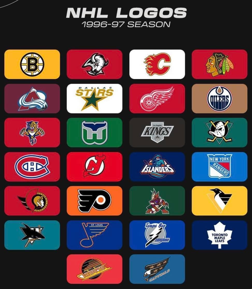
logos i’d keep from 96-97
bruins,
flames,
hawks,
avalanche,
red wings,
oilers,
whalers,
ducks,
habs,
devils,
islanders,
rangers,
senators,
flyers,
coyotes,
penguins,
sharks,
blues,
leafs
the rest i prefer the current logo (obviously many of the above already have the same logo as back then)
Miss the Whale – greatest jersey ever.
Out of all these, San Jose, St Louis and Toronto are the only ones that are currently better.
All of those look better than todays
Respectfully disagree. The Kings should wear the original Forum Blue and Gold Crown.
Those old Blues jerseys were amazing too
Capitals maybe
Straight up, there’s no better logo in sports than the St. Louis Blues.
Perfection.
Dallas
That Oilers color rebranding just wasn’t it. The orange and blue look so much more sharp.
Leafs, Canucks and Penguins too.
I love the Hartford whalers logo. My favorite team and my allegiance was to them until they’ve left. After that I drifted at sea till a kind fisherman rescued me and invited me to join him in being Islanders fan.
I miss that Stars logo as well
AND the Canucks… This logo and shirt that goes with it are the hottest in the NHL by far….
RIP Whale
I’m a Kings fan and I’ve never liked the black and silver Raiders colors. Forum blue (purple) and gold are my favorites. Last season’s 3rd jersey with the crown was the best in years.
Agreed on everything but the Kings. I think it should be the modern crown logo.
The current ducks ownership doesn’t own the exclusive rights to that logo / branding so it’s tricky for them to negotiate a licensing deal. I’ve heard a little about this from ducks sources but I’m no expert.