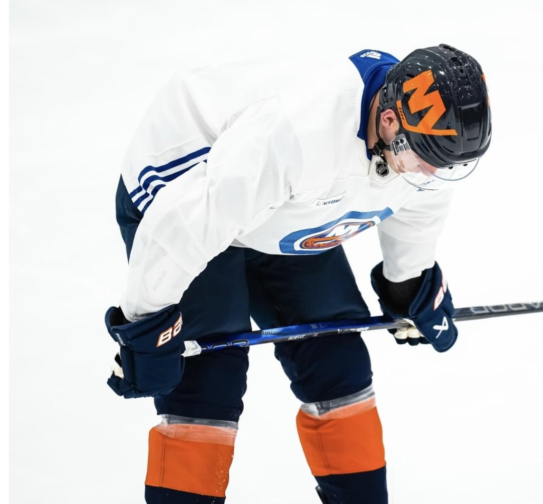
Weird choice putting the alternate “NY” logo on the helmet. I would have went with the “ISLES” wordmark or the NYI logo thats on the shoulder to create consistency throughout the full look.
char_limit_reached
Oh Christ. This went from bad to worse.
Da2550
These are an abomination
Mephisto1822
I kind of like it..:.
AJS76reddit
I have to say this entire look is growing on me. I hated it at first, but once I had the jersey in my hand I did a 180. I love the darker look that harkens back on our Y2K era jerseys (which admittedly were a little too Oilers-esq in color)
No_Opportunity_8068
Love the gloves. Subtle orange in the letters. The helmets are just a rerun of last years stadium series between Pittsburgh and Philly. So stupid


7 Comments
The logo on the helmets is disgusting
Weird choice putting the alternate “NY” logo on the helmet. I would have went with the “ISLES” wordmark or the NYI logo thats on the shoulder to create consistency throughout the full look.
Oh Christ. This went from bad to worse.
These are an abomination
I kind of like it..:.
I have to say this entire look is growing on me. I hated it at first, but once I had the jersey in my hand I did a 180. I love the darker look that harkens back on our Y2K era jerseys (which admittedly were a little too Oilers-esq in color)
Love the gloves. Subtle orange in the letters. The helmets are just a rerun of last years stadium series between Pittsburgh and Philly. So stupid