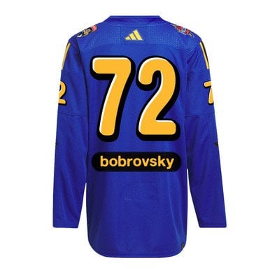
They look like canadian Kraft Dinner. I literally put a box beside this picture at work, and they were too similar. If you don’t know how that looks, just Google it, it’s worth a laugh.
I hate them, I truly think they are the ugliest jerseys I have seen that aren’t specialty made ones for junior hockey teams that get auctioned off for charity (i give those a pass because they are meant to be statement jerseys for the charity, and how can you not support that?).
s1lentastro1
horrendous. and I thought the reverse retro jerseys were ugly. (*sorry, but baby blue, red and yellow no pege, sue me lol*)
Interesting-Can1636
Anyone one of us could have made a better jersey in a ten year old nhl game.
I think just Bieber helped “design” it too😂
KatelynC110100
I don’t like them at all. The nameplate position is horrible lol. While I’m at it, anyone know where I can purchase last years all star eastern authentic jersey? I unfortunately missed out on purchasing them
Sarkosuchus
My thoughts on these jerseys can be represented well by a few quotes from the movie ‘Aliens’.
“You can count me out!”
“I say say we take off and nuke the entire stock of jerseys from orbit. It’s the only way to be sure.”
FLA-Hoosier
Looks like a cool ranch dorito
Rubric_Golf
The name plate font is disgusting.
rickygun13
Lol the lowercase letters it just looks like a half assed attempt.
Throwawaydontgoaway8
Ya and they’re not ugly like “so ugly it’s great” kind of jersey, genuinely hurts my eyes. Probably won’t even watch game
ObtuseMoose2017
Shame on you for thinking the nhl would the competent


10 Comments
They look like canadian Kraft Dinner. I literally put a box beside this picture at work, and they were too similar. If you don’t know how that looks, just Google it, it’s worth a laugh.
I hate them, I truly think they are the ugliest jerseys I have seen that aren’t specialty made ones for junior hockey teams that get auctioned off for charity (i give those a pass because they are meant to be statement jerseys for the charity, and how can you not support that?).
horrendous. and I thought the reverse retro jerseys were ugly. (*sorry, but baby blue, red and yellow no pege, sue me lol*)
Anyone one of us could have made a better jersey in a ten year old nhl game.
I think just Bieber helped “design” it too😂
I don’t like them at all. The nameplate position is horrible lol. While I’m at it, anyone know where I can purchase last years all star eastern authentic jersey? I unfortunately missed out on purchasing them
My thoughts on these jerseys can be represented well by a few quotes from the movie ‘Aliens’.
“You can count me out!”
“I say say we take off and nuke the entire stock of jerseys from orbit. It’s the only way to be sure.”
Looks like a cool ranch dorito
The name plate font is disgusting.
Lol the lowercase letters it just looks like a half assed attempt.
Ya and they’re not ugly like “so ugly it’s great” kind of jersey, genuinely hurts my eyes. Probably won’t even watch game
Shame on you for thinking the nhl would the competent